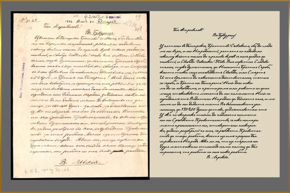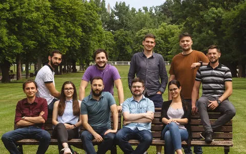

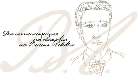
On the internet, even history can come alive. This Digital Story continues, in its own peculiar way, the tale of the most inspiring figure who unites us as a nation and as people: Vasil Levski, the 19th-century revolutionary revered as Bulgaria's national hero and known as the Apostle of Freedom. The letters written by Levski can now be seen lifted off the pages of books and turned into a digitized handwritten font. The first publicly available project of its kind was created by the philologist and typographer Stefan Peev.
People????
Letters make us who we are in so many ways. Today we have almost forgotten how to write by hand; it feels downright unnatural to grab a pen when we have to fill in some tedious paper form. Most likely we will soon stop needing to write this way altogether.
And yet handwritten letters stir something in us, and they have their own meaning, their own beauty, their own life. This Digital Story revives the handwriting of Vasil Levski as a font. So that we keep it for generations to come, and so that it reminds us that it really is letters that make us human.
Stefan Peev is more a man of words than a man of letters. A philologist by training, more than 20 years ago he also began working in typography. He creates Cyrillic versions of some of the most popular freely licensed fonts and, above all, develops the Bulgarian form of Cyrillic—the letter shapes traditionally used in Bulgaria—for a number of free fonts (that topic is big and deeply meaningful, so expect it soon as another Digital Story).
Our Age Is an Age of Freedom
In recent years Stefan has taken up something he himself calls “historical typography”—he resurrects old Bulgarian letters from various written monuments, as well as typefaces used at the dawn of printing in Bulgaria.
That is how he came to digitized handwriting fonts.
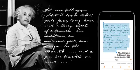
What is the idea? To bring into the digital world the letters written by famous people who have in some way earned it. Around the world, projects like this have been developed since the 1990s; the most popular are based on the handwriting of Michelangelo and Picasso, of Cézanne and Monet. There is even a special font that imitates the American Declaration of Independence. Einstein and Freud, Shakespeare and Kafka all have fonts “of their own.”
As Stefan puts it, historical typography gives birth to new cultural artifacts.
They exist in the Cyrillic world too—in Russia the handwriting of Pushkin and Gogol has been digitized this way, in Ukraine that of Taras Shevchenko, in Serbia that of Nikola Tesla and Vuk Karadžić. And somehow the only country missing from the whole list was ours. Until now, no such font had been developed and made available to anyone who wanted to use it.
Daring and Perseverance!
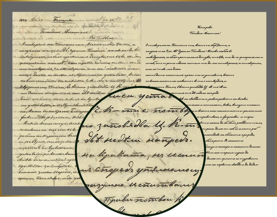
This is how the idea of creating a font from Levski's letters was born. It can be used to set the texts of a museum exhibition, or simply to let us touch, in some way, the magical letters of the Apostle. It was created from publicly available documents in the collection of the SS. Cyril and Methodius National Library.
The venture turned into a serious challenge for many reasons, Stefan says. For one thing, there is hardly any accumulated experience or methodology for digitizing handwriting. He had to do extensive research of his own, to analyze and to fill in the gaps. Nor were there enough resources to begin with—high-resolution facsimile materials are almost nonexistent.
“Every person's handwriting is an extremely dynamic quantity—it is constantly ‘in motion,’ it changes depending on the circumstances,” Stefan explains. “It depends on the nature of the text you are writing, on who you are writing to, on whether you have enough time to think your text through.”
Freedom, and to Each His Own
To succeed in his project, he studied the letters Levski left behind long and carefully. His impressions are worth noting. “There is a particular softness in the drawing of the letters, a fluency, an unusual rhythm. Sometimes in the middle of a word he unexpectedly raises the height of certain letters, for example ‘к,’ which ends up looking almost like a capital.”
The typographer noticed other peculiarities as well. The “о,” for instance, never starts from its topmost point, but from the middle or the bottom. This creates what Stefan calls a distinctive “dancing rhythm.” Levski uses both the Cyrillic capital “Н” and the Latin “N,” but it is important to remember that this was a time when Bulgarian had no established literary standard yet.
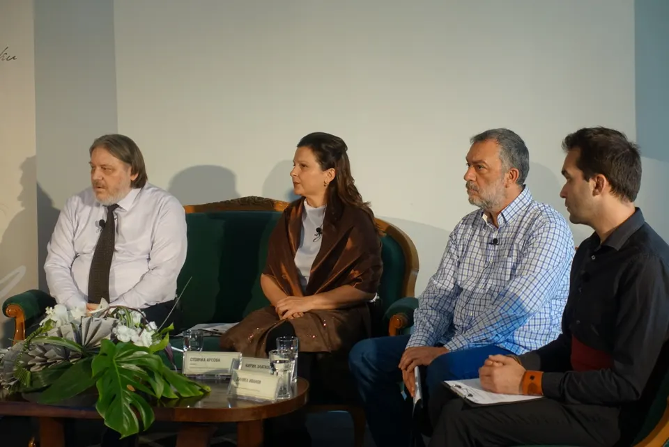
The project's consultant is Kiril Zlatkov, one of the leading typography specialists in Bulgaria. “Levski has one of the cleanest and most virtuosic hands of all our well-known revolutionaries. A handwriting that expresses devotion, method and perseverance,” he says. “We can describe it overall as beautiful, clean and harmonious. It has a strong, controlled character with a very interesting and rich inner dynamic that goes beyond standard clerical penmanship.”
The font includes glyphs for all uppercase and lowercase Cyrillic letters (including the old ones that are missing from today's standard language), Arabic numerals and punctuation marks.
Time Is in Us and We Are in Time
And so the letters are now available to everyone on the project's official page here. You need to fill in a short form describing what you will use the font for. Quite logical, really, since these are shapes based on the legacy of a person who is very special to all of us.
Stefan expects the font to be used by galleries and museums presenting exhibitions on Levski's life and work. But the only limits are the user's imagination and, of course, their respect for these so very important letters.
So only time will tell how this story continues, but its beginning is intriguing enough—the letters Levski used to write his notes are now on the web. Time is in us and we are in time. But the letters are in us too, and we are in the letters…